Project
Padrino delivery – Rebranding and new visual identity
Brief
Padrino is a delivery and courier service from Novi Sad with many years of experience. Padrino has decided to expand its range of services, take advantage of the opportunity on the market, and offer the people of Novi Sad food (and other necessities) delivery via a mobile app.
To adequately present this new service to the target group, improving the existing visual identity and creating a PADRINO brand communication strategy was necessary.
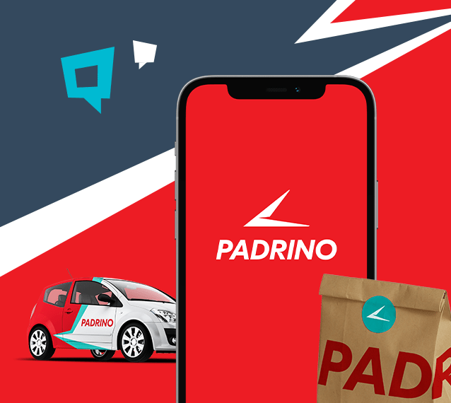
Solution
Although Padrino is a brand introduced previously, the stage of business development required rebranding and a more professional approach to visual identity. We decided to keep the basis of branding already recognisable to the target group and to do a rebranding, i.e. upgrade the brand, on that basis.
We removed unnecessary details and kept the basic shape with a slight modification – so that it now resembles both a boomerang and an arrow for movement, i.e. location. The sharp edges suggest speed as an essential component of the brand.
To connect the logo with the typography, we made an intervention on the letter R so that the typography can be used separately from the icon and be recognised as a PADRINO brand.
Regarding colours, we decided on a combination of turquoise and red. With this, we have achieved a connection with the industry, but at the same time, we have distinguished ourselves from our competitors.
Because of all this, the new branding is far more applicable and transparent, even when applied to smaller areas. This is extremely important because it facilitates the creation and improves the quality of promotional and printed materials.
How everything looks in the application, following the graphic standards book, you can see here. If you are in the stage of establishing a brand or it is time for rebranding, contact us. We have enough experience and creativity to create brands you will be proud of.