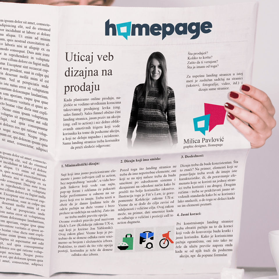
The impact of web design on sales
When we are planning the online sales, usually we manage the established steps of the so called sales funnel. Sales funnel is usually made by landing page, a clear call to action and a set of well-designed emotional triggers that lead the user to take action and which do not look attacking and dishonest. The landing page itself should give the user following answers:
– What are you selling?
– How much does it cost?
– Why should I trust you?
– What do I get from this?
For a successful landing page in the same percent is important the content of the page (text, photos, video etc.) and design of the page. In this text we will focus on design and in which way the design of a landing page can positively affect on success of sales funnels and to reach to the desired number of conversions.
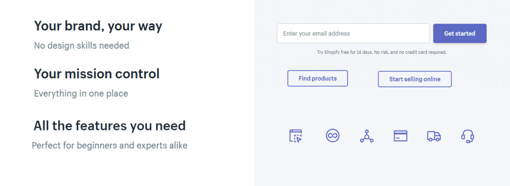
1. Minimalist design:
The website that has clearly positioned elements and clearly separated call to action, without the unnecessary ‘clutter’, in the form of numerous links that take you out of the website, pop-up forms and ads will show better performance compared to sites that have all of that. It should be taken into consideration that it is more difficult to have the attention of people nowadays for long time and they switch quickly from one content to another. That is why they should not be offered too many options. To support this there is a rule calls Hick’s law (the collection of UX law, the website created by Jon Yablonski). This law states: The time required to reach a decision grows in proportion to the number and complexity of choices. Basically that means that the more options there is, the more difficult it is for the user to make a decision about the choice.
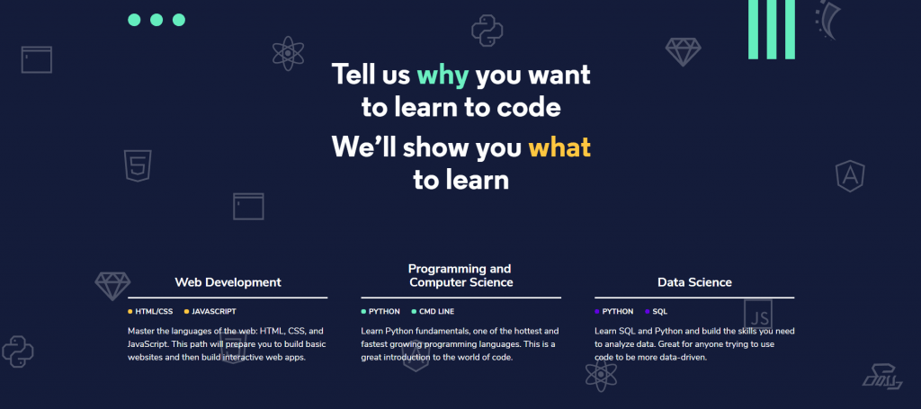
2. Design that makes sense:
In addition to the fact that landing page should not have unnecessary elements, those that are on it have to be placed on a particular system and designed in a certain way to provide the best possible user experience. The illustration of this is Fitt’s law from above mentioned collection of UX laws: Time to reach the goal depends from distance and size of the goal. This law can, for example, give the guidelines when it is being decided about the size and position of call to action button.
3. Consistency:
The design should be consistent. What it means? For example, the repeated elements should always have the same characteristics or that alignment of the elements used on one page should be used on the other. In other words- it should adhere to clearly defined standards in order for users to manage easily, and to get to this the elements have to be familiar.
4. Clear steps:
When constructing the landing page the attention should be on the steps that lead to conversion to be short and clear to the user. Considering that the users attention is limited, they also do not want to invest too much effort when they are asked to take action, e.g., to fill in the form. With the form you should be careful that it looks clear, and if there are plenty of fields that need to be filled in, then at least make clusters of parts into meaningful entities in order to gain transparency. From the user ask only for the most necessary information.
5. Responsiveness:
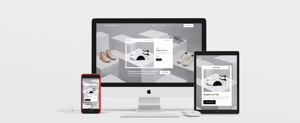
A responsive site that looks good and is functional on various devices is also something that contributes to users experience and that the user spends more time on the site, which is equal to bigger chance that it will come to conversion. Nowadays is genuinely known that an increasing number of users are browsing the internet exclusively via smart phones, which has led to a site that wants to be positioned better must have a well-made mobile version. In addition to responsiveness, loading speed is also important.
In the end, we can conclude that for a successful landing page it is not important that it satisfies only the esthetic criteria, same as it is not enough to have a good content. It is necessary to successfully transmit a message and to provide the user with the content with which he can be identified and that will help him to get to information he seeks through the fastest and most efficient way possible. That message needs to be effective, but at the same time free of all unnecessary elements. A well-delivered core of the message, clear steps and page that is easy to use – a simple recipe for a successful landing page that leads to conversion.