Color trends for 2026: our take on the palettes shaping brands
When we talk about 2026, our focus is not on who declared which “color of the year”, but on what kind of visual and emotional framework colors create for a brand, digital product, or communication campaign.
Trendsetters such as Pantone and platforms like WGSN are, for us, primarily radars. We use them to validate what we are already feeling in practice: how audience expectations, markets, and visual culture are shifting.
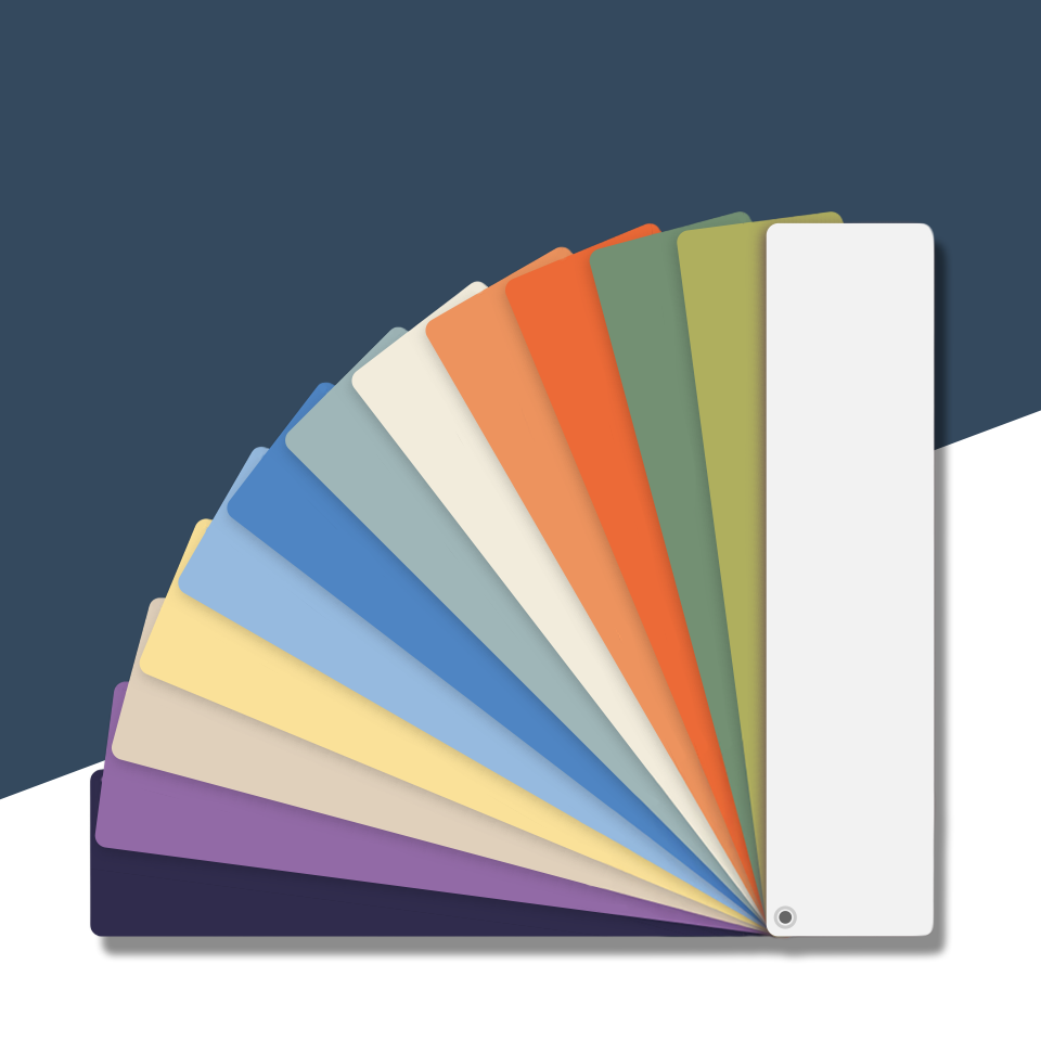
In 2026 we clearly see three key groupings:
- Vibrant tones as accents and dynamics,
- Earthy neutrals as base and stability,
- Pastels as carriers of emotion and gentle foundations.
The center of attention in 2026
Looking at the shared concepts of the most relevant trendsetters, several clear directions emerge. Vibrant red-pinks, oranges, and purples representing jewel tones provide strong emphasis, but not as the sole identity. We also see the rise of sophisticated pastels such as soft lilacs, yellows, and greens.
When it comes to neutral colors that are always in trend, whether seasonally or year after year, earthy tones in the form of creams, browns, and terracotta, accompanied by olive greens and deep blues, consistently find their place on almost everyone’s list of favorites.
Across proposed palettes, stable layers keep reappearing:
- Quiet and neutral tones, always safe,
- Desaturated hues that create a sophisticated look,
- More intense shades, striking showstoppers, and the “jewels” of the palette.
For us, these forecasts are inspiration, not necessarily the main focus. The point is not to follow everything literally, since every brand is a story of its own. What we can do is extract a usable framework from it.
What truly matters to us is creating a color palette for the brand that supports identity, UI, and campaigns, while staying true to its brand essence and representing it in the right way.
Is using trend colors important for the success of a brand or product?
In an era of content overload and fragmented attention, intensified by the constant pressure to adapt to trends, consumers are, to put it mildly, exhausted. As a result, brands are trying to find new, more relevant ways to stand out from the competition.
In the age of social media, trends shift practically every month; anyone who publishes content has a chance for that piece to become the next viral moment.
According to research by WGSN, one of the world’s leading consumer and trend forecasting services, 98% of respondents stated that their purchasing decision is largely influenced by color. This brings us back to brand identity, the colors that represent it, and the colors that appear on its products. The emotion that a brand conveys plays a major role in its success, and the easiest way to transmit that emotion without using words is… through color.
Let us take, for example, a situation where we are defining a color palette for a New Year’s product line based on a trending color. Our palette will not consist only of that one “trendy” color; instead, we will carefully select supporting colors that will give it space to shine. In this way, we get a harmonious palette that clearly highlights our primary color.
A second way to utilize trend colors, in cases where we already have a clearly defined primary brand color, would be to let the trend color take on the role of a complementary (supporting) color to our primary brand shade. This way, the trending color does not steal attention from the brand; it helps direct all spotlights towards us, the brand.
By this, we do not mean that you should stick strictly to the given trend options. We believe they should simply be “seasoned” a bit. For example, ask yourself: Which color do I associate with the holiday season? If the holiday period were the theme of our new collection, it would be ideal for red to dominate. Let us say that our chosen primary is Pantone Lava Falls, a deep red; we now need supporting colors that will help evoke the feeling of the holidays:
 When we create a brand, the goal is for it to be easily recognizable, memorable, and to make it easier for people to find it in any context. As important as it is for a brand to maintain control over its visual identity, it is equally important to allow it to live. That means giving it space to gradually change over time, to see how a new color might suit it, or to experiment with a new form or font. Of course, everything stays within boundaries that do not jeopardize the brand.
The most important thing is for the brand to remain consistent with itself in order to build a lasting relationship with its users, stay recognizable, and evoke emotion. This is something that can be achieved with color, sometimes even at first glance.
Our favorites
When we say that we follow trends, it does not mean that we do not filter them carefully. Exploring perspectives and reading the opinions of influential trendsetters from different fields, we selected a few favorites that won us over:

- Mandarin Orange
A lively orange with a slight red undertone, very warm and energetic. It feels like a “citrus” accent that evokes optimism, ambition, and a fresh start, which makes it an excellent statement color for buttons, CTAs, and highlight elements.

- Transformative Teal
A deep, cool teal shade, a fluid blend of dark blue and aqua-green tones that combines a sense of stability and natural growth. It is described as a color of transition and regeneration, a response to consumers’ growing need for ecological responsibility. In digital contexts, it appears calm, intelligent, and futuristic. It has been proposed as the 2026 Color of the Year by the WGSN forecasting service.

- Palm
A fusion between olive and lime green, warm and “natural”, it resembles the color of moss or matcha latte, which exploded as a trend on social media in the second half of 2025. Coincidence?
In digital, it works well as an earthy, organic accent or as a soft background color for brands connected to nature, sustainability, and wellness.

- Cocoa Powder
A warm, reddish-brown tone, rich yet sophisticated. It is described as the color of nostalgia and the need to slow down and enjoy life. Visually, it is associated with materials such as wood, wool, and ceramics, which hints at craft, handmade work, and therefore communicates credibility, warmth, and a sense of longevity in branding.

5. Wax Paper
A creamy off-white shade, almost neutral, with a soft warm undertone. It is described as a soothing, pearly color inspired by natural and bio-based materials such as silk, created as a warm alternative to cold whites and greys. In branding and UI, it works as a gentle, pleasant background color that radiates calm and subtle luxury.
These are just some of the many colors that have made it to the lists of trendsetters. What matters most is to ask questions such as: “Can this convey my brand message in the way I intend?” or “Will this create confusion in the visual expression of my brand?”
If you focus on what truly matters, trends naturally move lower on the list of priorities.
If you want to entrust your brand to someone who thinks this thoroughly and carefully about everything, including color, contact us.