Project
Rebranding – new visual identity
Client
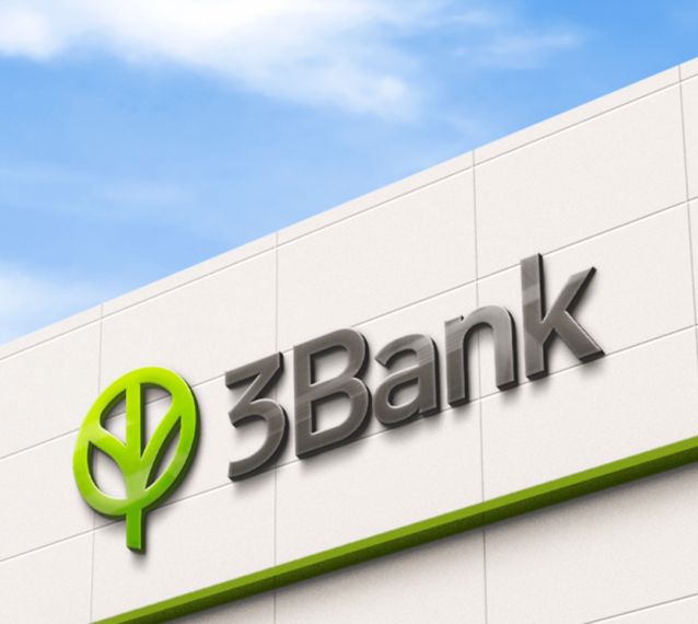
3 Bank (former Opportunity bank)
Brief
The existing visual identity and name of Opportunity Bank have been shown as insufficiently attractive, understandable and recognizable - especially among the primary target group of small businesses, farmers and lower-income citizens concentrated in rural areas. The client decided to change the name to 3 Bank and develop an appropriate visual identity to convey the brand's values and philosophy.
Solution
Starting from the name that represents three strategic goals – a positive impact on people, customers and employees, and positive impact on the environment with the economic prosperity of the bank itself and the community in which it operates, we decided to build a visual identity using simple geometric shapes and lines that intertwine and represent the symbol of the tree as the centre of the brand.
Within the canopy itself, the planet can be seen as a symbol of nature preservation and sustainability in every sense, complemented by the shade of green that fulfils the story.
We used the gradient to give the logo an even more modern tone, with a unique green nuance compared to other examples from the industry.
From a technical point of view, the logo is modern, long-lasting and applicable. It is suitable for different ways of making and made from various materials such as styrofoam, plastic, wood, metal, etc.
You can see what it looks like, along with the key elements of the brand book, here.