Project
BRAND IDENTITY: NEW HOSPITAL
Client
New Hospital
Brief
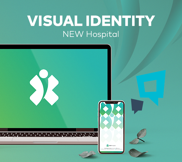
Since the client was a newly opened general hospital in Novi Sad, the most modern in the region, it was necessary to develop an original visual identity of that private hospital named - NEW Hospital. The goal was to use a visual identity to communicate state-of-the-art equipment, professionalism and knowledge, as well as dedicated approach to each patient and outstanding care that NEW Hospital provides.
Solution
We created a logo inspired by the most universal medical symbol – the cross, which we adapted in a different, authentic and elegant way. From the perspective of form, the cross resembles a butterfly that symbolizes life, hope and rapid transformation. At the same time, it is associated with a man with outstretched hands, which represents the one who asks, but also the one who provides help.
The color palette consists of special shades of green, which symbolically signifies health and well-being, while the gradient is based on the combination of the colors Tea and Leaf and can be used as a separate graphic element.
Also, carefully chosen typography corresponds to the brand’s values. The OMNES font looks very professional, while at the same time giving off a very positive and friendly impression with its rounded edges.
HERE you can explore more – and if you need our support in setting up brand identity for your business – contact us!