Logo, is that you?
Brand is the tone of communication, the emotions it provokes, the way it influence the user or environment and much more. The logo is the face of that. To show all of this, is a big challenge for a static logo. However, if we accept the possibilities given by digital formats and free ourselves of the attitude that the logo is only one, as it is, we are giving the opportunity for the logo to evolve into something more dynamic- logo with multiple faces, the so-called logo system or fluid logo.
The use of several different iterations of the logo in digital media is simple and affordable, and it allows a much wider storytelling of a brand unlike from a static symbol. Both the fluid logo and logo system are based on this concept, however the technical performance is different. Fluidity of the logo means that when it is being applied, logo is changing its appearance more or less, by the established algorithm or by changing the predefined elements, while the logo system is pre-created system of variations of the given logo.
1. Don’t touch the logo era
Symbols are always a key part of communication. Long time ago, on the walls of the cave we draw a plan for mammoths hunting, then we invented letters, to be better and faster, and then the industrial revolution came…Industry expansion has created a need for recognition, a personal seal, advertisement and finally a sign that was the face of the given product, service, brand, and so the logo was created. Consistency of the logo is the primary focus in order to achieve the recognition. It is imperative to keep the look as it is, with smaller variations for the different methods of application. Therefore we have a color logo, monochrome variations and in some cases a symbol that is an integral part of the logotype, but sufficiently recognizable to stand alone. And if someone may have had an idea that the logo has more variations than those mentioned, its application during the time before digital technologies would not be simple nor cheap. That is why no one touched the logo…Until now.
2. Think outside the logo
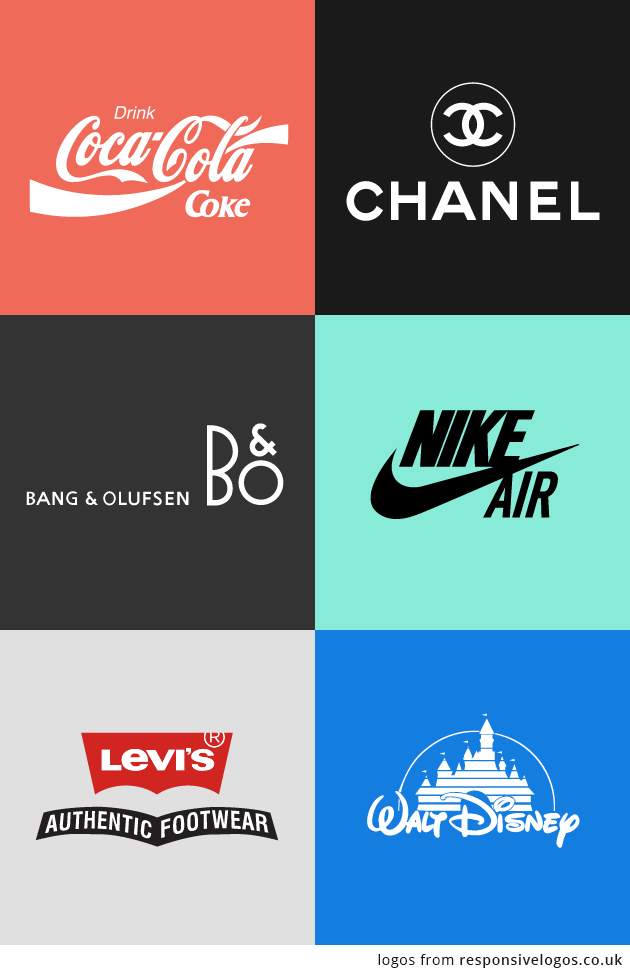
Today, while the digital industry is blossoming, unique, static, do-not-touch-me logo encounters two challenges: responsiveness and dynamics / fluidity. Response is not a new term, because in the pre-digital time it was often not necessary to apply the logo on a small surface and the designers were always while creating it, thinking about the possibilities of an application typical for the given brand. However, today there are many more things to think about: can the logo be an icon for the app, favicon, can it be seen properly in the header of the site, and on the mobile? Digital designer Joe Harrison illustrated nicely the responsiveness in his project Responsive logos.
Let’s say now that we have a logo that is recognizable for our brand and which is responsive, have we fully exploited the possibilities of digital technologies and does our logo represent our brand in the best way possible?
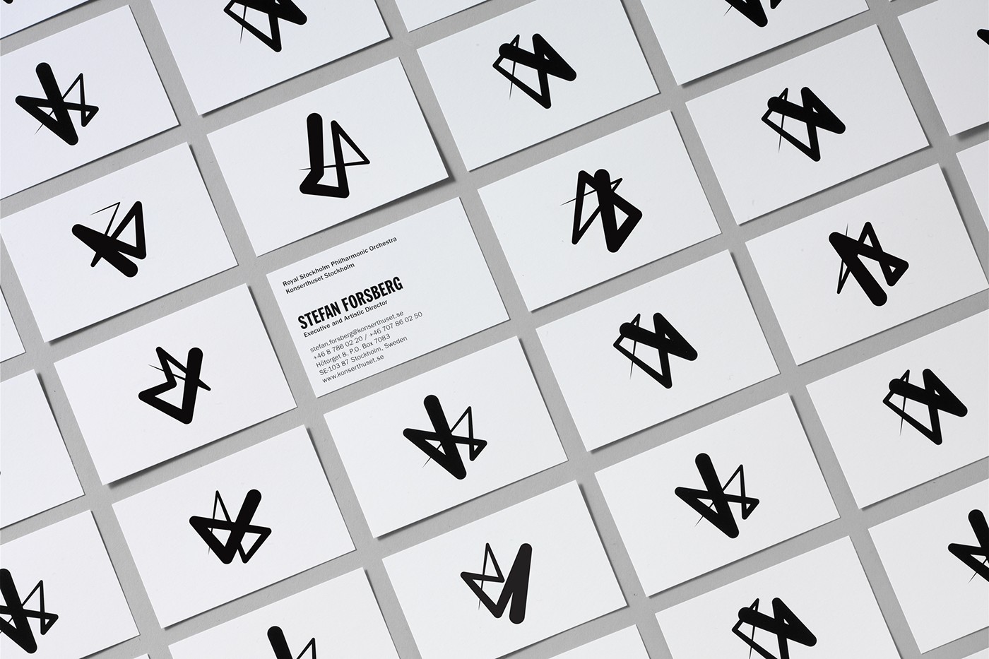
For example, Konserthuset Stockholm, a building with rich history, the host of the Royal Stockholm Philharmonic Orchestra, where annually is held more than 300 concerts, is creating the new visual identity. Already, from this brief description we can conclude the complexity of the task. The challenge is to present the width of the musical expression, movement and energy of music- through a logo that is common to the concert hall and Philharmonic Orchestra. Kurppa Hosk agency saw the solution in fluid symbol which illustrates the movement of the conductor rod.
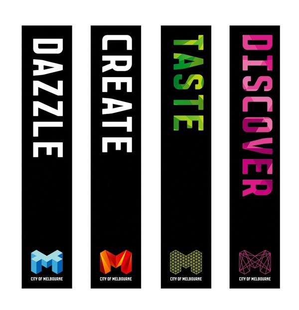
One more example of the abstract concept, presented through the logo system, is the city Melbourne. First of all, why did Melbourne decide to have a logo? Good visual identity causes in people positive, recognizable associations, to which they are bound. Setting up the visual identity of the city is actually setting up an emotional shortcut which will cause people to connect and present the city in the best possible way. When creating a product identity, usually we have a clear audience. When it comes to the city with much diversity, things get more complicated. The audience is all age groups, different nationalities, and different interests. The city is politics, administration, art, nightlife, tourist destination…Due to all of this, the focus of the new identity of Melbourne is precisely the celebration of diversity, through the symbol that retains its structure, but with colors, textures, patterns, is allowing to develop together with the city.
3. What is the logo system and how it works
The logo system is not something completely new and never seen before, only today thanks to digital formats it is finding wider application. In 2011 MIT Media Lab has set up a new visual identity based on algorithm that generates new logo for each use. Why? MIT Media Lab has dozens of independent organizations and sectors under its wings. In order to achieve a dose of diversity, and to still show the mutual interconnection, algorithm for generating the logo was based on similar graphic elements distributed over 7×7 network, with limited number of 40,000 variations.
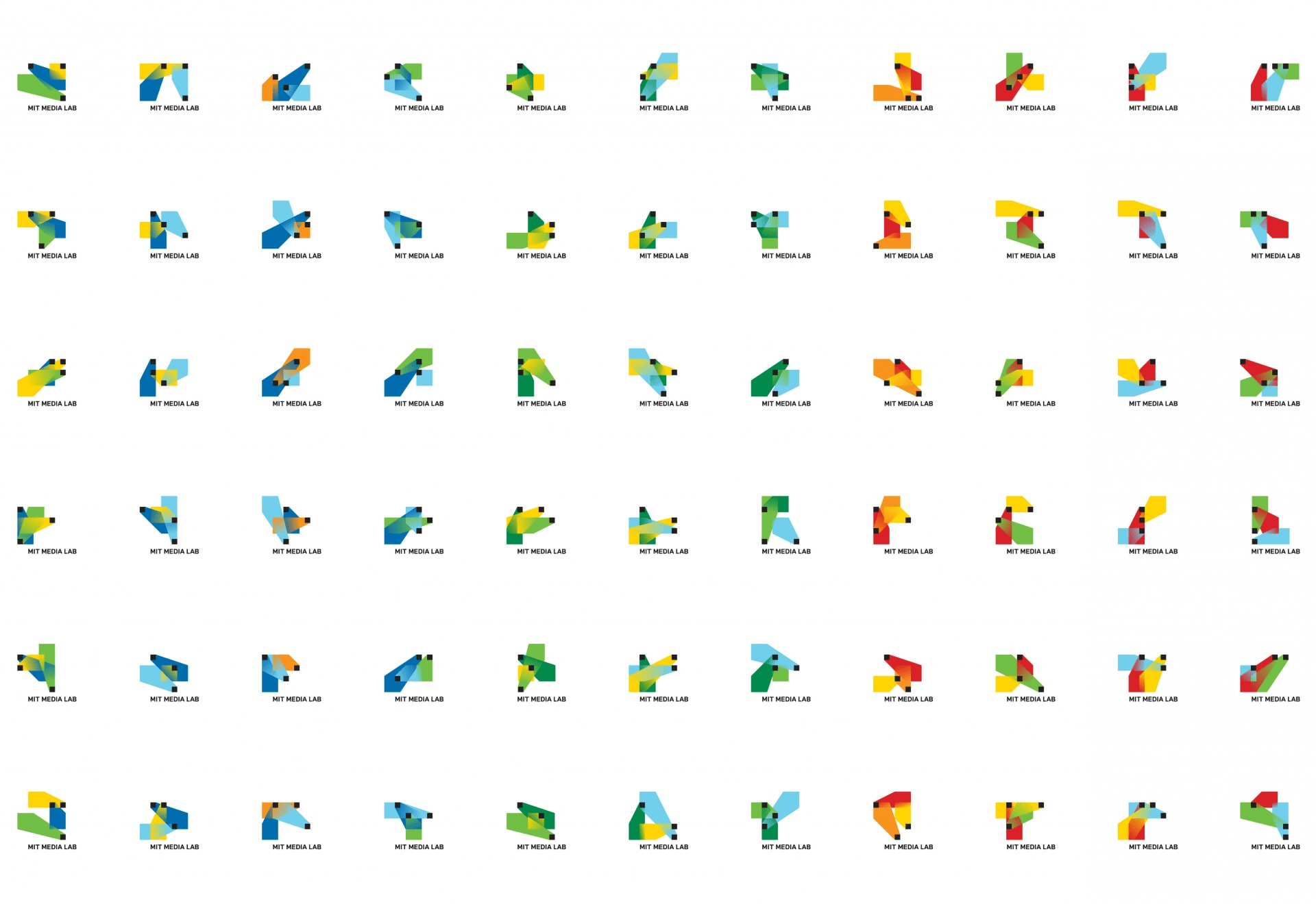
However, after some time it turned out that all these variations basically looked too much alike and did not leave a distinctive impression on their own. The conclusion is that the given logo system works just like a static logo, which was not the goal. MIT Media Lab solves this challenge by repeated rebranding and by creating a new logo system. This time, in order to achieve the distinctiveness of individual variations, each logo of the new system represents a stylized capital letter of the appropriate Media group to which this variation has been assigned. All letters are plotted on the 7×7 network, on which the previous logo system was based, which gives them a clear stylistic connection, while at the same time the symbols differ from one another.
From this we can see how important it is to create a system where each logo is sufficiently different in order for the existence of a system instead of one symbol would make sense. It is also very important that all of them are similar enough to be part of one system. The compromise between these two extremes is the key to a functional logo system.
Can the fluid be without the static and why not?
Fluid logo or logo system is not a trend. That is a must have. There are brands for which one simple logo is completely enough and there are brands for which variable logo gives a completely new freedom and expression. However, the basis of everything is a static logo, defined well enough to build around it the whole system or to carry by itself the entire brand message.