Why is visual identity important for your business?
In today’s competitive environment and the state of the market, businesses should pay attention to the power of branding – especially not companies with a long tradition, large and family-owned. Although branding may seem like a secondary item, strong and recognizable branding is the foundation for further growth.
Why branding is necessary for companies with a long tradition:
Loyalty: Recognizable brands create trust and loyalty. Customers and users develop an emotional connection with brands with which they share values. This loyalty is reflected in repeated purchases and further recommendations – invaluable for any business. A great example of this is the IKEA brand. As you probably already know, IKEA doesn’t just sell furniture – it sells the idea of creating a home. Through simple design, affordable prices, and inspiring displays, IKEA creates an emotional connection with customers who want a functional and beautiful home. People often share their IKEA transformations and ideas on social media, which shows the strength of brand loyalty.
Competitive advantage: Branding can make you stand out in a saturated market. A precise brand message positions you as a good choice for your target audience, giving you an edge over your competition, especially when new players emerge. In the smartphone market, Apple stands out with its elegant design, innovative technology and quality, and seamless hardware and software integration. In addition, an easily recognizable logo and a clear brand message create a loyal customer base.
Stronger brand, greater value: By developing a strong, recognizable brand, you increase the value of your products and services. Customers are willing to pay more for products and services associated with quality, trust, and a positive brand image, such as Tiffany & Co. This brand is synonymous with luxury and elegance. Customers are willing to pay a premium price for their jewelry because of its rich tradition, distinctive blue box, and quality.
Attracting talent: A well-defined brand attracts the best talent. Employees are attracted to companies with strong values and a clear purpose, making recruitment and retention easier. For example, Google’s strong focus on innovation and creativity and its fun workplace make it attractive to the best developers and engineers.
Quality branding implies consistency, relevance, and emotional connection. A consistent brand experience, from marketing materials to customer service interactions, creates a strong brand identity and builds trust. Also, your communication must be relevant to your target audience – understand their needs, values , and challenges so your brand message resonates with them. The best brands also make breakthroughs in communication to evoke emotions in the audience and thus connect with them more. You create a lasting connection beyond the product features by tapping into your customers’ and users’ desires and aspirations. As a brand, Disney evokes feelings of nostalgia and happiness in people of all ages. They use the power of storytelling and emotion to connect with audiences and create a lasting connection.
Key components of strong branding
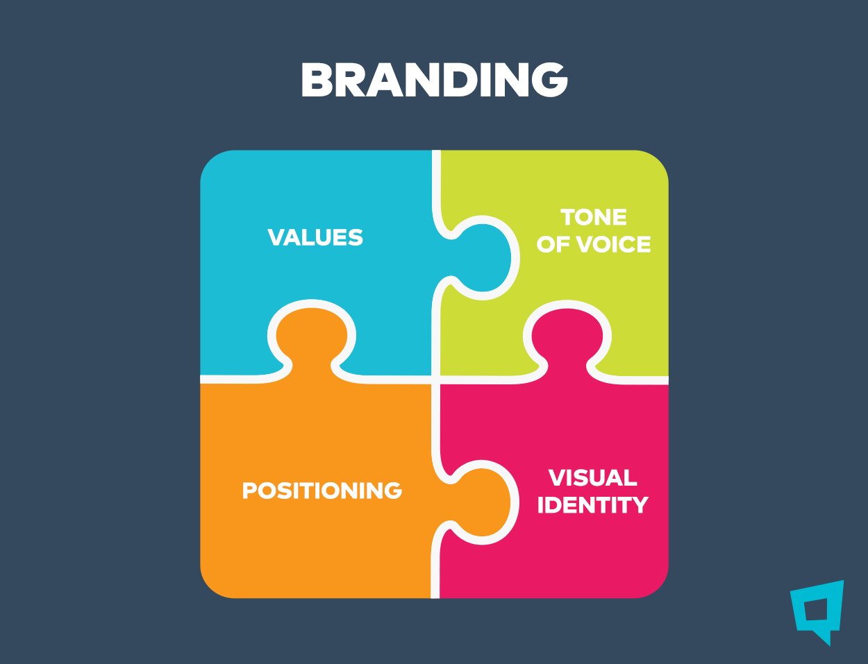
The key components can be divided into two main categories: visual identity and brand messages. Both work together to create a unique and recognizable image of your company.
Brand messages
Positioning defines your place in the market and how you differentiate yourself from your competitors. A brand voice is the personality behind your brand’s communication. It is the tone and style you use when communicating with your audience. Brand values are the core principles that guide your business decisions and shape your brand story. They represent what your company stands for and the impact you want to make.
Visual identity
Visual identity is the cornerstone of a strong brand. It creates a memorable first impression and shapes your audience’s perception of your brand.
Logo
The logo is the main character of your brand and should be simple and memorable. Avoid overly complex logos that are difficult to remember. In addition, the logo should be universally applicable, working in different sizes and media – from website to billboard. Although not always necessary, incorporating symbolism or subtle references to brand values throughout a logo design can mark its meaning. The Nike swoosh is one of the most recognizable logos in the world. It is simple, memorable, and evokes a sense of movement and speed. It also subtly represents the wing of the goddess Nike from Greek mythology, associating the brand with victory.
Colour palette
Colours have a profound psychological effect and can evoke specific emotions. The colour palette should be aligned with your brand values. For example, a brand focused on environmental sustainability might use calming greens and blues, while a brand emphasizing energy and excitement might opt for reds and oranges. The colour red has become synonymous with the Coca-Cola brand. The colour red stimulates the appetite and evokes a sense of energy, as stated, making it an ideal choice for a soft drink brand. You need to use colours that your target audience responds to. Research shows that specific colours can influence purchasing decisions. Colours should complement each other and create a visually pleasing whole.
Typography
Fonts say a lot about your brand’s personality. Serif fonts (with small decorative embellishments) convey a sense of tradition and elegance, while sans-serif fonts (without serifs) are considered modern and minimalistic. The Netflix logo uses a simple sans-serif font that is clean and modern. It reflects their streaming platform and the digital nature of the brand. Above all, the priority is that the fonts are clear and easy to read on different screen sizes and printed materials. Use a limited number of fonts consistently throughout your brand materials to maintain a cohesive visual identity.
Pictures
Visual elements such as photographs, illustrations, and pictograms are vital in conveying the story and emotional connection. Here’s how to use visuals effectively:
– The selected elements should be consistent with the brand’s voice and colour palette.
– Use and invest in high-resolution, professional-looking photos that reflect your brand’s and products’ quality.
– Use visuals that evoke the emotions you want your audience to feel.
– Choose photos and illustrations directly relevant to your brand story and target audience.
The famous ice cream brand Ben & Jerry’s has built a recognizable and successful brand based on a fun, informal, and cheerful atmosphere. Ben & Jerry’s relies on high-resolution photography of its ice creams and tasty treats, often in close-ups. They also use illustrations in their signature style that show people having fun and enjoying their products. The photos and illustrations are usually humorous and cheerful. Puns and visual metaphors are often used on packaging and digital channels. Each of these visual elements works together for Ben & Jerry’s to portray the brand’s fun, informal, and friendly atmosphere. Ben & Jerry’s digital presence is consistent with their overall brand identity, creating a recognizable and emotional connection with the audience.

Common branding mistakes to avoid
Inconsistent message: Mixed messages confuse your audience and tarnish your brand image. Maintain clear and consistent communication across all channels.
Neglecting brand development: The market and consumer preferences are changing. If you don’t adapt your branding over time, you can look outdated or portray what your brand doesn’t currently live up to. To prevent this from happening, it is necessary to do a brand refresh or rebranding from time to time.
Focus only on visuals: While a strong logo and design are important, branding is more than just aesthetics. It is about the overall experience and values that your brand represents, which are defined as part of the brand strategy.
More than a Fiverr transaction:
A logo may seem like a quick fix, but a well-crafted brand identity represents an investment in the future of your business. And that’s precisely where Homepage comes into play.
Our team of experienced experts will thoroughly understand your company’s core values, target audience, and market position. This foundation allows us to create cohesive branding that will resonate with your audience and drive growth. We don’t just create a logo; we also develop your brand’s voice, message, and book of graphic standards, ensuring consistency across all communication channels – website, social networks, and marketing materials. Consistency builds trust and strengthens your brand identity. Unlike a one-time Fiverr transaction, we become your long-term branding partner, providing ongoing support and adapting your brand as your business evolves.
We track key metrics to measure your investment, showing how your brand drives engagement, site traffic, and sales. Choose a branding partner for your business, not just a logo designer.

